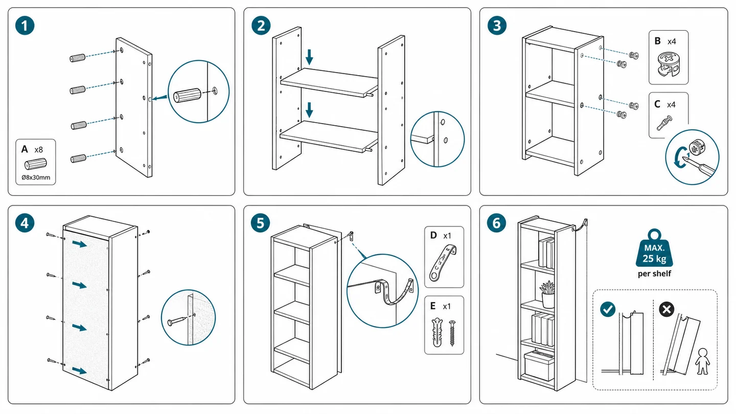
Créer une notice de montage : méthode, modèle et exemples
Créer une notice de montage claire à partir de photos produit : méthode en 7 étapes, modèle de vignette, notice sans texte façon IKEA et exemples concrets.
Un client ouvre le carton de sa nouvelle bibliothèque en kit, étale les panneaux dans le salon et trouve la notice de montage : une page photocopiée, un paragraphe par étape et une seule photo du meuble terminé. Vingt minutes plus tard, les excentriques sont à l'envers, le fond est monté côté façade, et l'avis une étoile est à moitié rédigé : « impossible à monter ». Le meuble n'y est pour rien ; c'est le document qui a échoué. Bonne nouvelle : créer une notice de montage efficace suit une méthode reproductible, et vous pouvez aujourd'hui la bâtir à partir de simples photos produit.
Transformez vos photos produit en vignettes d'étape numérotées avec le générateur d'illustrations de notice de montage — aucun fichier CAO nécessaire.
La notice de montage est la page qui pèse le plus lourd dans l'expérience client de la plupart des marques. Elle est lue au pire moment — les mains prises, la patience à bout, des pièces partout — et jugée instantanément. Ce guide couvre tout le parcours : pourquoi les notices échouent, les sept étapes pour en créer une, un modèle de vignette, les notices sans texte, trois exemples et les erreurs à éviter.
Pourquoi une notice de montage échoue
Chacun des échecs ci-dessous est une décision de conception, donc réversible :
- Du texte là où il faudrait une figure. « Insérer le tourillon B dans le trou pré-percé 4 du panneau C en veillant à orienter le chant fini vers l'extérieur » : quatre décisions dans une phrase. Un dessin avec une flèche dit la même chose en une demi-seconde.
- Des photos au lieu de dessins. Une pièce en chêne clair photographiée sur un parquet en chêne clair : arêtes, trous et orientation disparaissent. Les notices utilisent le dessin au trait pour une raison : il ne garde que la forme et les liaisons. C'est la logique du plan d'ensemble en documentation d'ingénierie : montrer la structure, masquer le bruit.
- Plusieurs actions dans une étape. « Fixer les pieds, insérer les taquets et monter la traverse » : le lecteur inversera l'ordre ou en oubliera une.
- Pas d'identification des pièces au départ. Quand quatre vis se ressemblent et qu'une seule est la bonne, le lecteur devine. Et une supposition, c'est un filetage arraché.
- Des pièges d'orientation non signalés. Toute pièce montable à 180° de travers le sera, sauf si le dessin signale l'asymétrie.
- La photo du produit fini pour toutes les étapes. Le lecteur a besoin de l'état de l'assemblage à cette étape, pas de la destination.
Presque chaque ticket au service client, pièce abîmée ou réclamation pour « vis manquantes » remonte à l'un de ces points. La méthode suivante est conçue pour les prévenir.
Créer une notice de montage en 7 étapes
Les outils d'illustration technique traditionnels supposent un modèle CAO 3D à éclater et annoter. Or la plupart de ceux qui rédigent vraiment la notice — chefs de produit, vendeurs sur Amazon ou Cdiscount, rédacteurs techniques, petits fabricants — n'ont pas le fichier CAO, ou le fournisseur refuse de le partager. Le flux basé sur la photo supprime cette dépendance.
Étape 1 : montez le produit vous-même et notez chaque action
Montez le produit une fois, lentement, en notant chaque action physique au moment où vous la faites : poser, insérer, aligner, serrer, retourner, vérifier. Notez où vous avez hésité : chaque hésitation est le futur appel d'un client. Ce journal brut est le squelette de la notice, et il compte généralement deux fois plus d'actions que prévu.
Étape 2 : photographiez chaque stade
Photographiez les pièces à plat, puis l'assemblage à chaque stade, toujours sous le même angle de trois quarts. Ces photos n'iront pas dans la notice : ce sont les références des illustrations. Pas besoin de studio ; il faut des pièces bien séparées, la fixation visible et une orientation sans ambiguïté. C'est ici que l'approche photo se distingue des outils CAO : SOLIDWORKS Composer ou Cadasio ont besoin du modèle 3D pour produire une vue ; ici, la photo est la source.
Étape 3 : une action par étape
Reprenez le journal et découpez-le pour que chaque étape contienne un seul verbe. « Fixer le panneau latéral avec quatre boulons » : une étape. « Fixer le panneau latéral, puis le dessus » : deux étapes. Même si le total vous paraît élevé, ne fusionnez pas : dix étapes claires valent mieux que six ambiguës. Numérotez dans l'ordre strict de montage.
Étape 4 : ouvrez sur la liste des pièces et une vue éclatée
Avant l'étape 1, deux vignettes : une liste des pièces où chaque composant et chaque fixation sont dessinés à une échelle reconnaissable avec leur quantité (« A ×4, B ×8 »), et idéalement une vue éclatée d'ensemble. Une vue éclatée écarte les pièces le long de leurs axes de montage pour que le lecteur assemble mentalement le produit avant d'y toucher. Le générateur d'illustrations en vue éclatée en produit une à partir des mêmes photos, et ce guide explique comment la lire.
Étape 5 : générez une vignette au trait par étape
Convertissez chaque photo de stade en dessin d'instruction : trait noir sur fond blanc, pièces nouvelles de l'étape en trait épais, pièces déjà posées estompées en gris clair, flèche bleue sur le mouvement, repère de fixation dès qu'il y a de la quincaillerie. Décrivez l'action dans le prompt — « insérer le boulon d'excentrique dans le trou pré-percé, flèche le long de l'axe d'insertion, repère boulon B ×4 » — puis générez. Une structure de prompt constante garde toutes les vignettes dans la même famille visuelle : le document se lit comme une notice, pas comme douze images sans rapport.
Étape 6 : montez la mise en page
Placez les vignettes dans une grille numérotée, de gauche à droite et de haut en bas, avec le numéro d'étape en grand dans un coin. Limitez les légendes à une courte ligne à l'impératif, ou supprimez-les si le dessin porte l'action (voir plus bas les notices sans texte). Réutilisez le même squelette pour chaque produit : c'est le rôle du modèle de notice de montage décrit ci-dessous.
Étape 7 : testez sur quelqu'un qui n'a jamais vu le produit
Confiez le brouillon et le produit en carton à un collègue, et observez en silence. Chaque pause, chaque retour en arrière, chaque mauvaise vis est un défaut du document, pas de la personne. Corrigez, régénérez les vignettes concernées, refaites le test. Un seul tour de ce type détecte plus de problèmes que toutes les relectures internes.
C'est toute la méthode. Rien n'a exigé de modèle 3D, de licence CAO ni d'illustrateur : seulement des photos et le savoir que vous avez dans les mains.
Modèle de notice de montage : l'anatomie d'une bonne vignette
La vignette d'étape est l'unité de base d'une notice de montage pas à pas, et les meilleures obéissent à une grammaire visuelle stricte. Pour aller plus loin, l'article sur les flèches, les pièces et la disposition des fixations dans les dessins de montage détaille chaque convention. En bref :
- Un grand numéro d'étape. Le lecteur suit sa position du coin de l'œil : rendez le numéro impossible à manquer.
- Une seule action. Si vous ne pouvez pas légender la vignette en cinq mots, ce sont deux vignettes.
- Des flèches de mouvement. Une flèche épaisse sur l'axe exact du mouvement : insertion, rotation, pression. Courbe pour tourner, avec un sens sans ambiguïté. La flèche, c'est la phrase.
- Des repères de fixation. La vis ou l'excentrique agrandi dans un petit cercle, avec sa lettre et sa quantité (« B ×4 »), relié par une fine ligne de repère à son emplacement. La quincaillerie est la première source d'erreur au montage : elle a son propre canal visuel.
- Le neuf en gras, l'ancien estompé. Pièces manipulées en trait plein, tout le reste en gris clair : l'œil tombe tout de suite sur le travail à faire.
- Des indices d'orientation. Là où une pièce peut être mal montée, montrez le détail distinctif — chant fini, rainure détrompeuse — et si besoin une paire ✗/✓.
- Le moins de texte possible. Chaque libellé supprimé est une chose de moins à traduire et un endroit de moins où être mal compris.
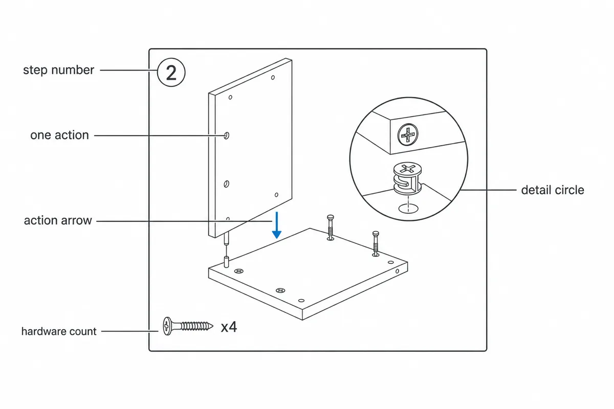
Une vignette qui respecte cette grammaire se lit en deux secondes environ, soit à peu près l'attention que lui accordera un client à genoux, tournevis en main.
Pour la page entière, gardez une trame fixe : en-tête (produit, référence, version), bloc des pièces et de la quincaillerie, grille d'étapes, pied de page avec le contact du service client. Le modèle d'instruction de travail fournit cette structure — en-tête, bloc pièces, grille d'étapes, pied de page — et se prête très bien à une notice de montage grand public : la structure n'est décidée qu'une fois.
La notice de montage sans texte (façon IKEA)
L'ameublement a prouvé depuis des décennies qu'une notice de montage peut se passer presque entièrement de mots : c'est le style que tout le monde appelle « façon IKEA ». (Le terme désigne ici uniquement un style visuel ; ManualFig n'est ni affilié à IKEA ni approuvé par IKEA.) Trois raisons de s'y intéresser :
- Une seule notice pour tous les pays. Pas de traduction, pas de livret multilingue, pas de mise en page qui casse quand l'allemand s'avère 40 % plus long que l'anglais.
- Une discipline visuelle forcée. Sans phrase de secours, chaque ambiguïté doit être levée dans le dessin, qui s'en trouve meilleur.
- Un suivi plus rapide. Le lecteur ne bascule plus entre lecture et action ; il regarde et il agit.
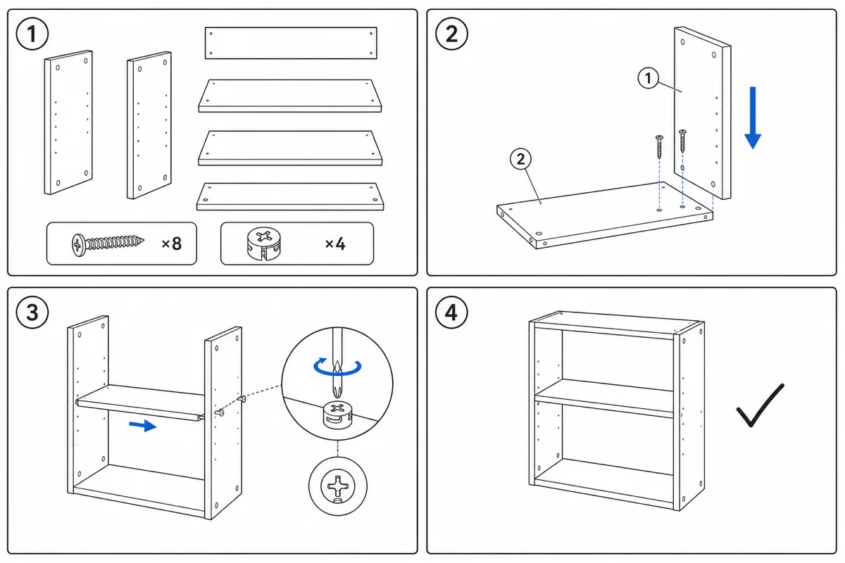
Les conventions qui font fonctionner le sans-texte : des numéros pour la séquence, des flèches pour le mouvement, des cercles agrandis pour les fixations et les détails, des vignettes ✗/✓ pour les erreurs classiques, une silhouette partout où il faut deux personnes ou une posture précise, et une icône de téléphone vers le service client comme seul « texte » de la page. L'échelle compte plus que d'habitude : dessinez les fixations à leur taille relative réelle pour que le lecteur puisse poser une vis sur la page et vérifier.
Le sans-texte est un curseur, pas un interrupteur. Beaucoup de bonnes notices sont majoritairement sans texte, avec une légende seulement là où l'étape ne peut vraiment pas se suffire — une valeur de couple, un « faire ceci avant cela ». Si une légende survit à la relecture, gardez-la sous sept mots. Et pour un produit vendu en France, les avertissements de sécurité écrits doivent figurer en français.
3 exemples de notices de montage
Voici trois exemples dans les catégories qui génèrent le plus de sollicitations au service client.
Exemple 1 : meuble en kit (une bibliothèque)
Séquence : vue d'ensemble des pièces et de la quincaillerie → vue éclatée → tourillons d'excentrique dans les côtés (flèche sur l'axe d'insertion, repère « A ×8 ») → tablettes sur les tourillons (les deux mains visibles ; c'est l'étape à deux personnes, signalée par le pictogramme correspondant) → excentriques tournés de 90° (flèche courbe, cercle de détail ✗/✓ : pas assez tourné / verrouillé) → fond cloué (✗/✓ sur l'orientation de la face finie) → meuble redressé, avec la fixation murale dessinée comme une vignette obligatoire à part entière, pas comme une note de bas de page. Le meuble est la catégorie qui se prête le mieux au sans-texte : le générateur de notices de montage de meubles est réglé exactement pour ce style.
Exemple 2 : électronique grand public (pied et support d'écran)
Court mais impitoyable : vis à pas fin, connecteurs fragiles, une seule orientation correcte. Cinq vignettes : socle boulonné à la colonne (repère avec la taille du filetage), plaque VESA au dos de l'écran (cercle de détail sur les logements de vis — c'est là qu'on serre trop fort dans la dalle, d'où un pictogramme « serrer à la main »), écran posé sur le crochet du pied (la flèche montre l'angle d'approche, pas seulement le sens), câble passé dans le clip, puis une vignette finale ✓ montrant l'écran correctement en place. Les cercles de détail font l'essentiel du travail : à l'échelle réelle, ces éléments mesurent quelques millimètres.
Exemple 3 : équipement d'extérieur (une plancha au gaz sur chariot)
Beaucoup de fixations semblables, de grandes pièces encombrantes et un état final qui touche à la sécurité. La notice s'ouvre sur un tableau de quincaillerie dessiné à l'échelle 1:1, pour comparer les boulons directement sur la page. Le chariot se monte en huit vignettes, l'ombrage neuf en gras / ancien estompé guidant le lecteur à travers des étapes de châssis très semblables. La vignette de raccordement du gaz enfreint volontairement la règle du sans-texte : elle porte une légende et un contrôle d'étanchéité avec un détail ✗/✓ à l'eau savonneuse, parce qu'ici une erreur est dangereuse et pas seulement agaçante. Les étapes critiques pour la sécurité méritent des mots ; tout le reste reste visuel.
Dans les trois cas, la même grammaire : vignettes numérotées, une action, flèches, repères, ✗/✓ pour les pièges connus. Seul le sujet change.
Les erreurs courantes quand on crée une notice de montage
- Rédiger de mémoire au lieu de monter le produit carnet en main
- Ne photographier que le produit fini, sans référence pour les étapes intermédiaires
- Fusionner des étapes pour réduire le nombre de pages
- Sauter la liste des pièces parce qu'elles « sont évidentes » — elles ne le sont jamais
- Des repères de fixation sans quantité, ou une quincaillerie dessinée à une échelle trompeuse
- Des flèches qui montrent où arrive une pièce, mais pas comment elle y va
- Laisser les pièces réversibles sans marquage en croisant les doigts
- Un style graphique qui change d'une vignette à l'autre, comme trois documents agrafés ensemble
- Publier sans un seul test auprès d'un lecteur novice
- Considérer la notice comme terminée pour toujours — quand le produit évolue, régénérez les vignettes concernées
FAQ
Quel logiciel pour créer une notice de montage ?
Il faut de quoi dessiner les figures et de quoi mettre en page. La voie classique est une suite d'illustration CAO (SOLIDWORKS Composer, Creo Illustrate, Cadasio), qui exige le modèle 3D et les compétences pour la piloter. La voie photo génère les vignettes au trait directement depuis des photos — le générateur d'illustrations de notice de montage couvre les figures — et votre outil de mise en page habituel (Word, InDesign…) se charge des pages.
Existe-t-il un modèle de notice de montage à télécharger ?
Oui : le modèle d'instruction de travail reprend la trame en-tête, bloc pièces, grille d'étapes et pied de page, adaptable à une notice client.
Quelle différence entre notice de montage et instruction de travail ?
Même squelette, lecteur différent. La notice de montage s'adresse à un client qui monte le produit une fois ; l'instruction de travail est la version atelier : des étapes visuelles numérotées pour un opérateur qui répète la tâche toute la journée, avec valeurs de couple, contrôles qualité et maîtrise des révisions en plus. Partez d'un modèle d'instruction de travail commun et les deux documents restent cohérents.
Combien d'étapes doit compter une notice de montage ?
Autant qu'il y a d'actions uniques, soit en général plus que dans le premier brouillon. Découper a presque toujours raison : une étape évidente ne coûte rien au lecteur, une étape fusionnée et ambiguë peut lui faire rater tout le montage.
Faut-il une notice sans texte ?
Par défaut, oui pour les produits grand public vendus dans plusieurs pays, avec des légendes uniquement pour les étapes critiques pour la sécurité ou impossibles à dessiner. La plupart des bonnes notices finissent à 90 % en pictogrammes, 10 % en texte.
Faut-il des fichiers CAO ?
Non. La CAO est exigée par la chaîne d'outils traditionnelle, pas par le livrable. Des photos nettes de chaque stade suffisent pour produire dessins au trait, vignettes numérotées et vues éclatées.
Voir aussi : générateur d'illustrations en vue éclatée, générateur de notices de montage de meubles, modèle d'instruction de travail.
Auteur

Chercheur · University of Arts in Poznan
Davie Chen est chercheur à la Faculté d’animation et d’intermédia de la University of Arts in Poznan. Ses travaux portent sur l’IA générative appliquée aux figures scientifiques, aux illustrations de brevet, aux visuels d’instructions et à la rédaction académique. ManualFig AI est l’un des outils issus de ces recherches.
Voir le profil de l’auteurCatégories
Plus d'articles
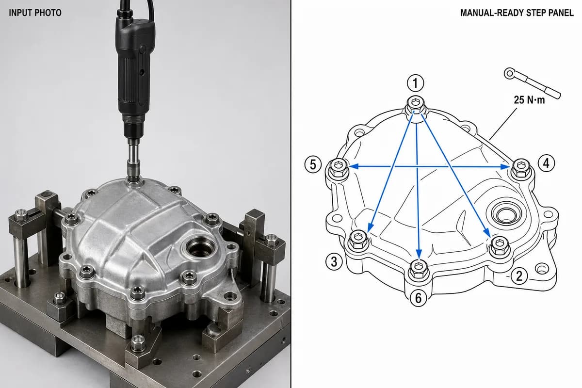
Instructions de montage en production : format, exemples et illustration par poste
Ce qu'une instruction de montage en production doit contenir, la mise en page une étape par page, trois exemples de poste (couple, orientation, contrôle) et une trame à copier.
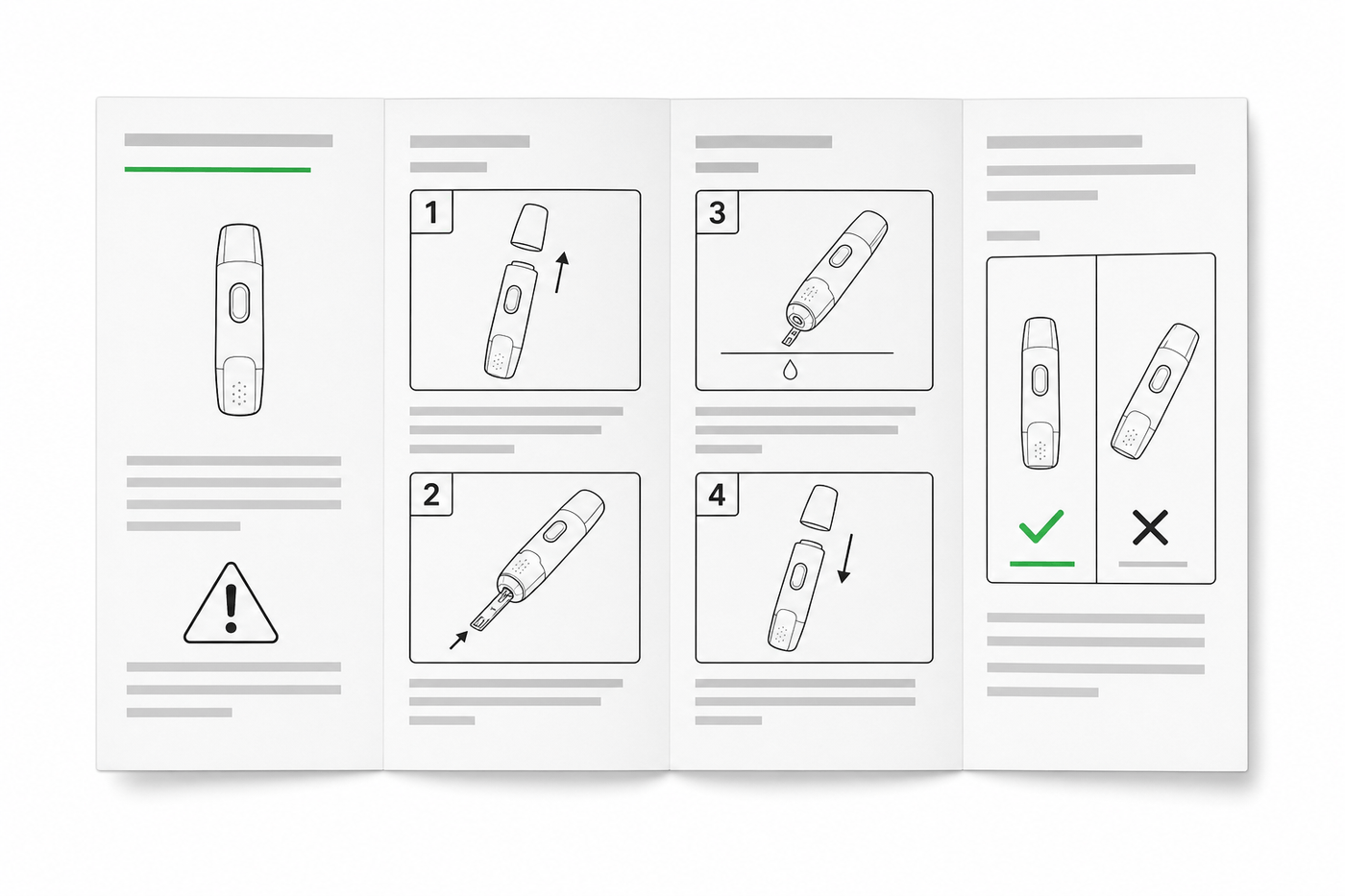
Guide IFU : mise en page, symboles et exemples
Guide pratique pour concevoir une IFU de dispositif médical : mise en page, symboles ISO 15223-1, avertissements, illustrations et trame réutilisable.
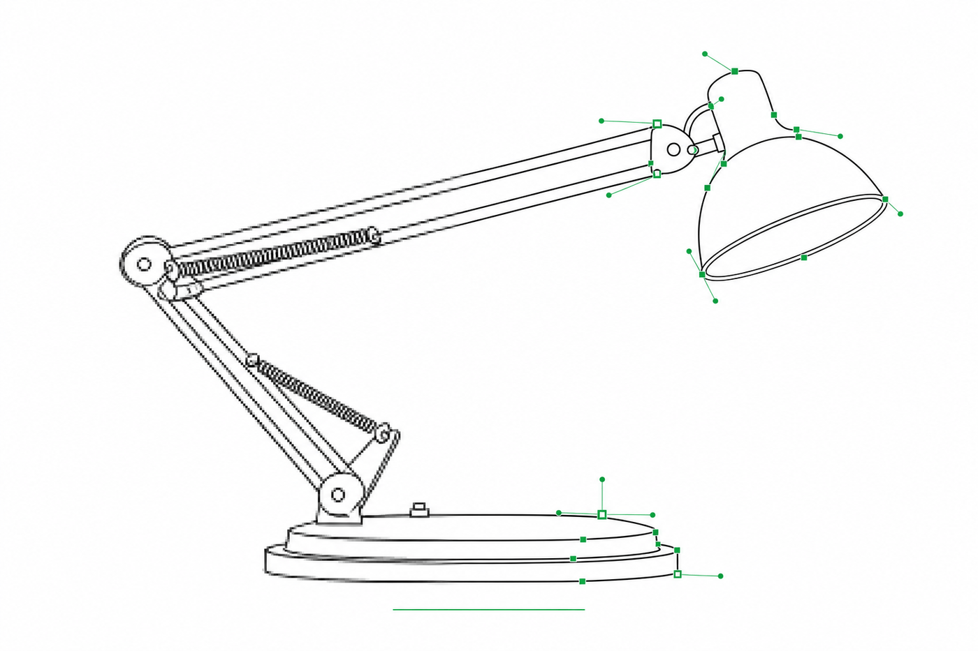
Image en SVG pour Illustrator : obtenir des traits éditables pour le dessin technique
Pourquoi tant de conversions image → SVG arrivent dans Illustrator sous forme de contours remplis impossibles à restyler — et deux workflows qui produisent des SVG à traits (centerline) dont l'épaisseur de ligne reste modifiable.