What Are Safety Symbols and Instruction Pictograms?
Safety symbols and instruction pictograms are standardized graphic marks used in manuals and on products to warn about hazards or show required and prohibited actions without relying on written language, so the message survives across languages and literacy levels.
The main families of safety symbols
Several standards govern the graphics you see in manuals. ISO 7010 defines registered safety signs in five shapes and colors: red circles with a slash for prohibition, yellow triangles for warnings, blue circles for mandatory actions, green squares for safe conditions, and red squares for fire equipment. ISO 3864 sets the underlying design rules for colors and layout.
In North America, ANSI Z535 governs product safety labels and pairs the graphics with signal words graded by severity: DANGER (will cause death or serious injury), WARNING (could cause death or serious injury), and CAUTION (could cause minor or moderate injury). Beyond safety, everyday pictogram systems include laundry care symbols, electrical symbols, and packaging handling marks.
How safety symbols are used in manuals
Inside a manual, safety messages typically appear as a signal-word panel: the general warning triangle or a hazard-specific symbol, the signal word, a short statement of the hazard, and the action to avoid it — always placed before the step where the hazard occurs. A symbols glossary near the front of the manual explains every pictogram used, which regulated documents such as medical device IFUs are expected to include.
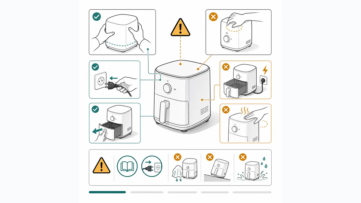
Instruction pictograms extend the same idea to non-hazard content: hands showing correct grips, crossed-out wrong actions, arrows for direction of motion. Used consistently, they let a single set of figures serve every language market.
Designing and producing instruction pictograms
Good pictograms follow the conventions readers already know: solid silhouettes, high contrast, one idea per symbol, and correct use of the standard shapes and colors for anything safety-related. Where a registered ISO 7010 symbol exists for a hazard, use it rather than inventing a new one.
For product-specific illustrations — the figure showing where the hazard is on your device, or the correct handling gesture — teams draw line art in the manual's style, increasingly by generating draft figures from product photos with AI and refining them. Safety-critical artwork should always get a final review from the people responsible for product compliance.
Frequently asked questions
What do the colors of safety symbols mean?
Under ISO 3864/7010 conventions: red means prohibition or fire equipment, yellow with a black triangle means warning, blue circles mean a mandatory action, and green means safe condition or emergency egress. ANSI Z535 adds severity-graded signal words: DANGER, WARNING, and CAUTION.
What is the difference between DANGER, WARNING, and CAUTION?
They grade severity. DANGER marks a hazard that will result in death or serious injury if not avoided; WARNING marks one that could; CAUTION marks one that could cause minor or moderate injury. The words are not interchangeable and should be chosen by risk assessment.
Can I design my own safety symbols?
Prefer registered standard symbols (ISO 7010) whenever one exists for your hazard — readers already understand them and regulators expect them. Custom pictograms are appropriate for product-specific instructions, but safety-related artwork should follow standard shapes and colors and be reviewed by your compliance team.
Illustrate safety instructions clearly
ManualFig generates clean safety and warning illustrations from your product photos — consistent with the rest of your manual, ready for compliance review.
Try the safety illustration generator