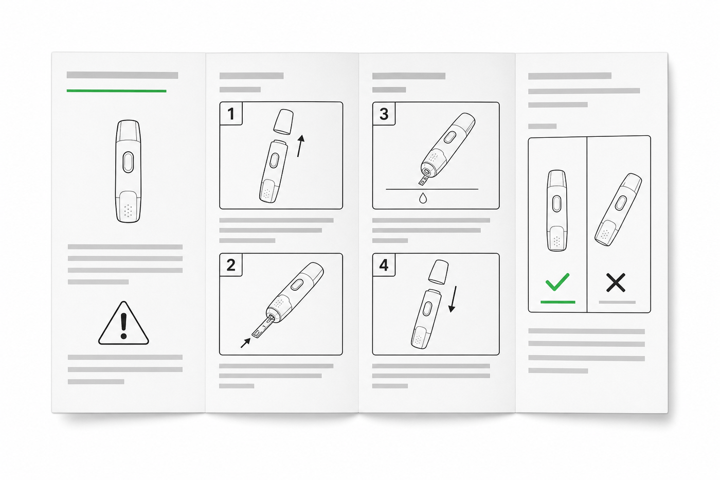
IFU Design Guide: Layout, Symbols & Examples
Practical IFU design guidance for medical devices: page layout, ISO 15223-1 symbols, warning panels, illustrations, and a reusable section template.
A regulatory reviewer, a usability engineer, and an end user all read the same IFU — and they fail it for different reasons. The reviewer flags a warning that is present but buried in paragraph twelve. The usability engineer watches a study participant skip the text entirely and misassemble the device because step 3's illustration shows the wrong orientation. The user just calls support. All three failures are design failures: the required content existed, but the layout, symbols, and illustrations did not deliver it.
That is what "IFU design" actually means. Not decoration — the discipline of arranging required information so that the intended user, in the intended environment, gets it right the first time. This guide covers the layout rules, symbol standards, illustration conventions, and a working section template. It is design guidance, not regulatory advice: your regulatory team owns the final word for your device class and markets.
ManualFig's Medical Device IFU Illustration Generator produces the numbered panels, correct/incorrect comparisons, and warning illustrations this guide describes — from a product photo or a written step.
Where the design requirements actually come from
IFU content requirements are regulatory; IFU design requirements mostly live one level down, in the standards those regulations lean on:
| Framework | What it demands of design |
|---|---|
| EU MDR 2017/745, Annex I | Information "easily understood by the intended user"; residual risks communicated; legibility as a formal requirement |
| FDA 21 CFR Part 801 | Adequate directions for use; prominence and legibility of required statements |
| IEC 82079-1 | The horizontal standard for preparing instructions for use: structure, language, media, legibility minimums |
| ISO 15223-1:2021 + Amd 1:2025 | The symbol vocabulary for medical device labeling — manufacturer, date, lot, sterility, and more |
| IEC 62366-1:2015 + Amd 1:2020 | Usability engineering: the IFU is part of the user interface and gets validated like one |
Source version check (25 August 2026): the links above point to the official EU, US, ISO, and IEC records. Confirm the editions adopted or harmonized for your device, market, and quality system before treating any requirement as applicable.
The practical consequence: an IFU is not "done" when the content checklist is complete. Under IEC 62366-1 thinking, the IFU is a risk control — and a risk control that users skip, misread, or cannot follow has failed regardless of what it technically contains.
Layout: design for the reader who doesn't read
Usability studies keep reproducing the same finding: users scan, they do not read. IFU layout should assume it.
- One action per step. If a step's illustration needs two arrows doing different things, it is two steps. Numbered steps also give support staff and auditors an unambiguous reference ("step 4").
- Pair every step with a picture, text beside it. The illustration carries the action; the sentence carries the qualifier ("until it clicks", "for 10 seconds"). Keep each pair on one visual line so the eye never has to search for which text belongs to which panel.
- Reading order must survive a glance. Number the panels and arrange them in the reading direction of the target language. A 2×2 grid without numbers is ambiguous — with numbers it is not.
- Respect legibility minimums. IEC 82079-1 and accessibility practice push body text toward larger sizes than marketing designers like, and higher-risk or elderly-user devices should go larger still. Thin gray text on white fails real users before it fails a review.
- Leave room for language growth. German runs ~30% longer than English; if your master layout is packed at 100%, every translation will break it. Design the master at ~70% text density.
Symbols and warning panels
Two symbol systems coexist in an IFU and should not be improvised:
- Labeling symbols (manufacturer, date of manufacture, use-by, lot, "consult instructions for use", sterility) come from ISO 15223-1. Use the standard glyphs, at standard sizes, and include a symbols glossary section — many markets require one.
- Warnings need a consistent panel design: signal word, the hazard, the consequence, and how to avoid it — placed before the step where the hazard occurs, not collected in a wall of text at the front that nobody reads twice.
For behavior you must prevent, the strongest design pattern is the correct/incorrect comparison panel: the right way and the wrong way side by side, with an unmistakable check and cross. It communicates across languages and literacy levels:
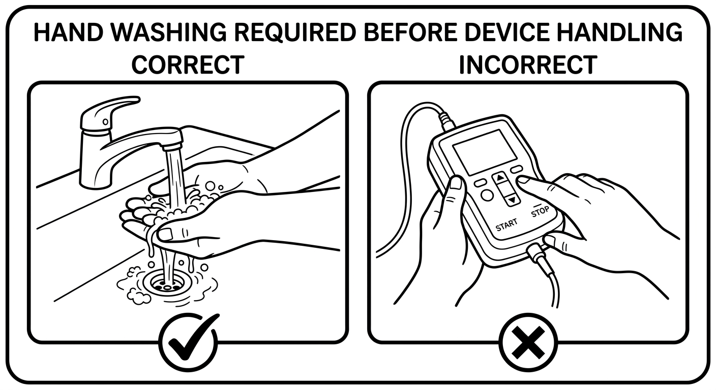
We covered the anatomy of these panels in depth in our safety illustration guide.
Illustrations: line art, not photos
Nearly every professionally produced IFU uses black-and-white line art rather than photography, for reasons that compound:
- Selective emphasis. A line drawing shows the latch and omits the reflections; a photo shows everything at equal weight.
- Print survival. IFUs are printed small, cheap, and grayscale. Line art survives; photographic halftones turn to mud.
- Localization and revision. Line art with numbered callouts (numbers, not embedded words) needs no re-shooting when text changes or the product gets a cosmetic revision.
- Regulatory neutrality. Line art shows the device class-representatively without implying a specific serial, color, or configuration.
The working vocabulary of IFU line art is small and worth standardizing across your document: numbered panels, solid arrows for motion, thin leader lines with numbered callouts for parts, a consistent warning triangle, and check/cross marks. This annotated example names each element in place:
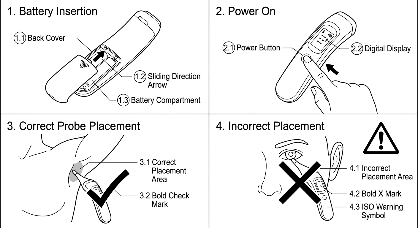
Both figures in this article were generated with ManualFig from short text descriptions — no illustrator, no drawing software. For print-and-web reuse, export SVG so line weights stay editable; our editable-stroke SVG guide covers when to generate SVG directly versus convert from an image.
An IFU section template
Section order varies by device type, but this skeleton covers what reviewers expect to find and gives each design element a home:
- Device identification — name, model, UDI reference, manufacturer block with ISO 15223-1 symbols
- Intended use / intended purpose — device, user, environment, patient population
- Contraindications, warnings, precautions — designed panels, ordered by severity, repeated later at point of use
- Device overview diagram — one labeled line drawing with numbered callouts; the callout numbers become the shared vocabulary for every later step
- Setup / preparation — numbered illustrated steps
- Operation — numbered illustrated steps, one action each
- Cleaning, maintenance, storage — including reprocessing limits where applicable
- Troubleshooting — symptom → cause → action table
- Symbols glossary — every symbol used, with meaning
- Technical data, disposal, support contact, IFU revision date
Two design notes on the template. First, the overview diagram (item 4) is the highest-leverage figure in the document: every subsequent step can say "press button (3)" instead of re-describing the part. Second, keep the revision date and IFU reference number designed into the footer of every spread — detached pages are a real failure mode.
Electronic IFU changes less than you'd hope
eIFU (permitted for defined device categories in the EU under Regulation 2021/2226, with analogous provisions elsewhere) removes the paper constraint but none of the design constraints: the same legibility, the same symbols, the same illustrated steps — plus new ones, like ensuring the current revision is what users actually retrieve, and that figures remain legible on a phone. If anything, eIFU raises the bar for illustrations, because SVG line art that scales cleanly from phone to print becomes the only format that serves both.
The mistakes that fail reviews
- Warnings present but not prominent — buried in prose instead of designed panels at point of use
- Text and illustration disagree — the figure shows an older housing revision; usability participants follow the figure, every time
- Photos where line art was needed — illegible at print size, obsolete at the next cosmetic revision
- Unnumbered panels — ambiguous reading order, untestable in a usability study
- Improvised symbols — a hand-drawn "sterile" glyph is a finding, not a style choice
- No room for translation — the German edition ships with 5.5pt type because the English master was full
Produce the figures
The text of an IFU comes from your risk file and your regulatory team. The figures can come from a generator:
- Open the Medical Device IFU Illustration Generator and describe the step — or upload a product photo as the structural reference.
- Generate numbered step panels, overview diagrams with callouts, and correct/incorrect warning panels in a consistent line-art style.
- Export PNG for the layout draft and SVG for the print master, then place them in your IFU template.
Design the document so a scanning reader still gets the critical path — and let every figure earn its place by making one action unmistakable.
Related tools: Medical Device IFU Illustration Generator, Safety Instruction Illustration Generator, Instruction Manual Generator with Pictures.
Author

Researcher · University of Arts in Poznan
Davie Chen is a researcher at the Faculty of Animation and Intermedia, University of Arts in Poznan, studying generative AI for scientific figure creation, patent illustration, instruction graphics, and manuscript drafting. ManualFig AI is one of the research-to-product tools built from this work.
View author profileCategories
More Posts

How to Create Medical Device IFU Illustrations with AI
A practical workflow for turning device photos, procedure text, and risk notes into clear medical IFU instruction panels with ManualFig.

Safety Instruction Illustrations: Correct/Incorrect and Warning Panels
How to draft safety instruction illustrations for manuals using correct/incorrect panels, warning cues, risky step callouts, and review gates.

Product Line Art for Manuals: Examples, Prompts, and Output Formats
How to use product line art in manuals, packaging inserts, help centers, and support docs, with prompt examples and PNG/SVG output guidance.