Quick Start Guide Examples and Template
What a great quick start guide looks like, a reusable template structure, and how to generate the setup figures that go inside it.
A customer cuts the tape on a new box, lifts the lid, and finds a folded card on top of the product. In the next sixty seconds they will decide whether this purchase was a good idea. If the card gets them from "what's in here" to "it's working" without a single re-read, they keep the product and maybe leave a good review. If the card is a wall of text, a tiny diagram, or a QR code that opens a 40-page PDF, the product goes back in the box - and the review writes itself.
The quick start guide is that card. It has one job: get the product working in three or four steps, mostly through pictures. Everything else - specs, warranty, troubleshooting trees - belongs in the full manual. This post covers what a great quick start guide does, a reusable template you can copy, three worked examples, a prompt you can paste, and the print-versus-screen decisions that trip teams up.
Generate the setup figures with the Quick Start Guide Illustration Generator.
What a great quick start guide does
A quick start guide is not a shrunk-down manual. It is a different deliverable with a different goal: remove every reason the customer might stop. That means it should:
- Get to first success in three to five steps, never more.
- Lead with images and use words only as short labels.
- Show the one action that proves the product works, not every feature it has.
- Use the same product silhouette and the same arrow style on every step so it reads as one piece.
- Survive translation - short labels, not sentences, because a paragraph that fits in English may overflow the panel in German or Japanese.
A good test: hand the card to someone who has never seen the product and say nothing. If they can set it up without asking a question, the guide works. If they flip it over looking for more words, a figure is missing.
A reusable template
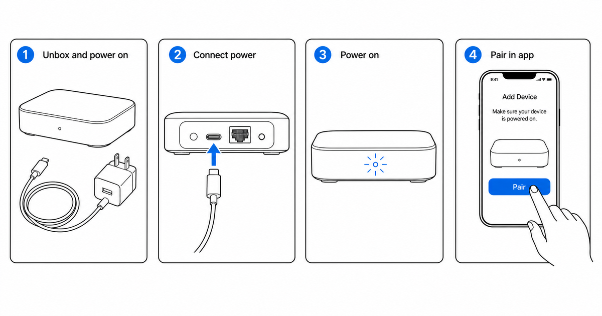
Most quick start guides follow the same skeleton. Copy this structure and fill in the figures for your product:
- What's in the box — a simple parts layout. Every item the customer should find, drawn flat with short labels. This doubles as a "did I lose a piece" check.
- Set up — the physical preparation: plug in, insert batteries, attach a base, or mount to a wall.
- Connect — power on, wait for the indicator, pair to an app or network. This is where most setups fail, so give it the clearest figure.
- First use — the single action that proves it works: play a sound, take a reading, run a cycle, start a workout.
- Status & help — what the indicator lights mean, plus one place to get support (a short URL or QR code, not a phone tree).
Keep each step to one figure and a short label. If a step needs a paragraph, it belongs in the full manual, not the quick start. Number the steps, keep the numbers in reading order, and reuse the same arrow color throughout.
Three worked examples
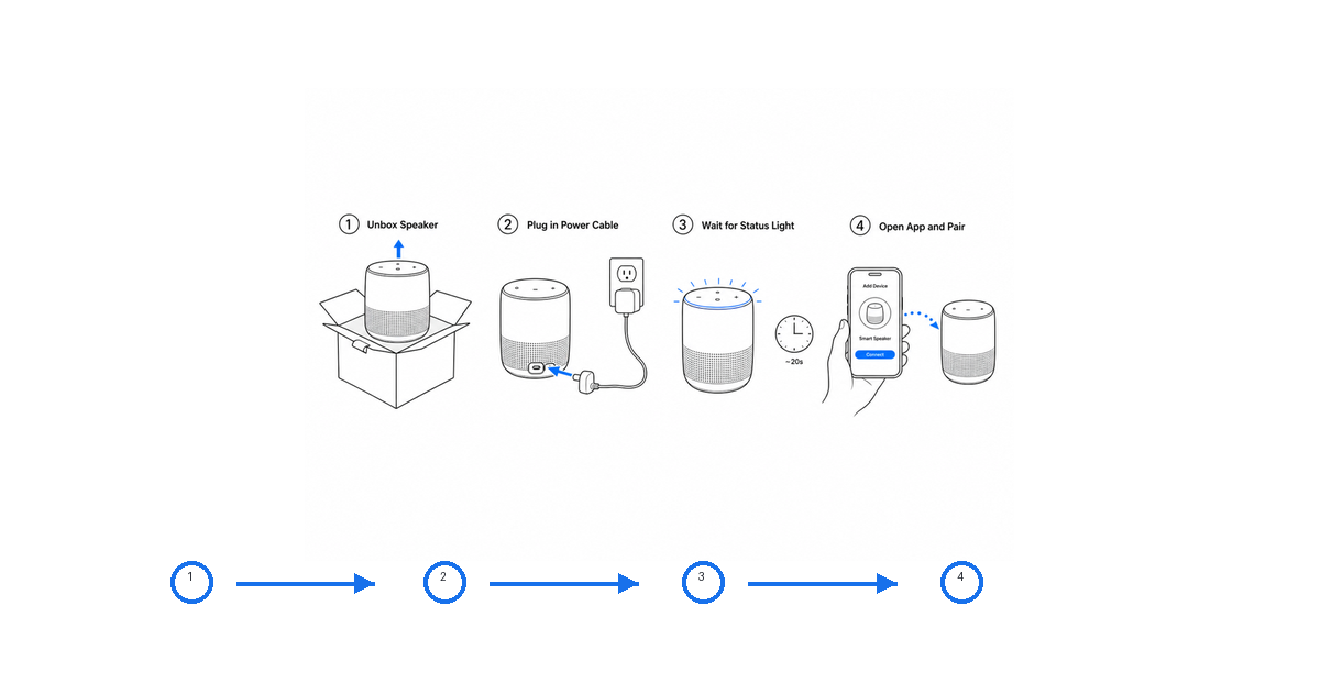
Smart speaker. Four numbered figures in a row: unbox and identify the speaker and power cable, plug into the wall, wait for the ring light to pulse, open the app and tap pair. Blue arrows show the power cable going in and the finger tapping pair. The "first use" proof is saying a wake word and getting a response - shown as a small sound-wave cue, not a paragraph.
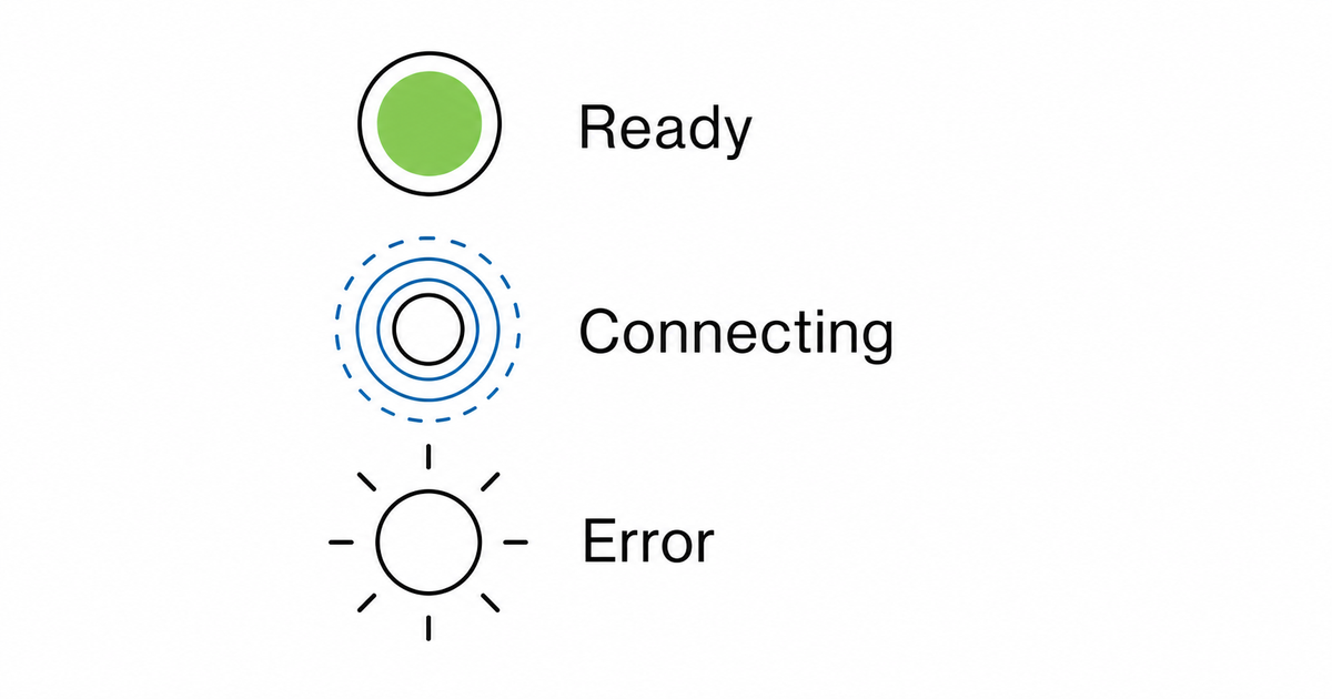
Wearable. Four steps in minimal line art: snap the band onto the charger and wait for the battery icon, press and hold the button to power on, open the app and pair over Bluetooth, then slide the band onto the wrist. Because wearables lean hard on indicator behavior, add a small status-light legend beside the steps rather than burying it in text.
Appliance. A countertop blender or air purifier: position it on a flat surface with clearance, connect the hose or seat the filter, plug in and power on, then run the first cycle. Orientation arrows matter here - which way the filter faces, which side has clearance - so the arrows carry information the photo never could.
In all three, the figure does the explaining. The label only confirms what the arrow already showed.
A prompt template
When you generate the figures, treat the product photo as the geometry reference and the prompt as the instruction brief. Start from this and swap in your product and actions:
Create a four-step quick start guide figure row from this product photo.
Step 1: show what's in the box - the device and the power cable, drawn flat with short labels.
Step 2: plug the power cable into the rear port; use a blue arrow for the insertion direction.
Step 3: power on and show the indicator light pulsing while it connects.
Step 4: open the app and pair; show a finger tapping the pair button.
Use clean black line art on a white background, numbered steps, blue arrows, short labels only.
No logo, no brand text, no realistic shadows, no decorative background.
Leave even margins so it fits a printed insert.
For the status legend, generate it as its own panel so you can reuse it:
Create a status-light legend panel in clean line art.
Show three indicator states stacked vertically: solid (ready), pulsing (connecting), blinking (error).
Use a short label beside each state, white background, no brand marks.
Common mistakes to avoid
The recurring mistakes are easy to spot once you know them:
- Too many steps. If you are on step seven, you are writing a manual. Move the extras out.
- Paragraphs instead of labels. A quick start guide that needs reading is a quick start guide that failed.
- Arrows that point near the action but not at it. The arrow should land on the exact contact point - the port, the button, the latch.
- Inconsistent style. Mixing a photo, a screenshot, and a line drawing across three steps makes the card feel broken.
- Labels that overflow after translation. Design for the longest language you ship, not English.
- Burying status meaning in prose. Lights are visual; explain them with a visual legend.
- A help link that opens a wall. The support pointer should reach a human or a short page, not a 40-page PDF.
Print vs screen (PNG or SVG)
A quick start card usually lives in two places: folded inside the box (print) and mirrored on a help page or app onboarding screen (screen). Those have different format needs.
- Print. The card goes to a layout at a fixed physical size - often A5 or a folded A4. Export SVG so the line weights and arrows stay crisp at the printer's resolution. A 1200px PNG dropped into print lands near 96 dpi and the print team sends it back.
- Screen. A help-center figure or an onboarding image lives at one display size on one channel. PNG is fine, and it is the right call if the figure includes any generated shading the SVG export would lose.
If you do not yet know where a figure will live, default to SVG - downgrading to PNG is one click, while the reverse means a new generation. Whatever you ship, archive the prompt and reference image alongside the export so a future change (new button, new indicator color, new model) is a prompt edit, not a redraw.
FAQ
How many steps should a quick start guide have?
Three to five. If first success genuinely needs more, the product is complex enough to warrant splitting setup from first use, but the card itself should still stop at the moment the product visibly works. Everything after that goes in the full manual.
Should a quick start guide use photos or line art?
Line art for the setup steps, almost always. A photo shows what the product looks like; line art shows what to do - it can enlarge the button that matters, hide the clutter that does not, and put an arrow on the exact action. Keep photos for the box shot or marketing, and use line art for the steps.
What's the difference between a quick start guide and a user manual?
The quick start guide gets the product working; the user manual explains everything else. The quick start stops at first success and is mostly pictures. The manual covers features, troubleshooting, care, and compliance. See Product Manual vs User Manual vs Quick Start Guide for which images each one needs.
Can I reuse the same figures across print and digital?
Yes, if you generate them as vector-friendly line art and keep one consistent style. Export SVG for the printed insert and PNG for the help page from the same source figure, so the product looks identical wherever the customer sees it.
Related: Packaging Insert Instruction Generator, Instruction Manual Generator with Pictures, Product Manual vs User Manual vs Quick Start Guide.
Author

Researcher · University of Arts in Poznan
Davie Chen is a researcher at the Faculty of Animation and Intermedia, University of Arts in Poznan, studying generative AI for scientific figure creation, patent illustration, instruction graphics, and manuscript drafting. ManualFig AI is one of the research-to-product tools built from this work.
View author profileCategories
More Posts

Manufacturing Assembly Instructions: Format, Examples, and How to Illustrate Each Station
What a manufacturing assembly instruction must contain, how to lay out one step per page, three worked station examples (torque, orientation, inspection), and a template you can copy.
IFU Design Guide: Layout, Symbols & Examples
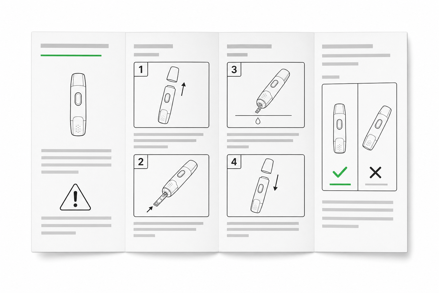
Practical IFU design guidance for medical devices: page layout, ISO 15223-1 symbols, warning panels, illustrations, and a reusable section template.
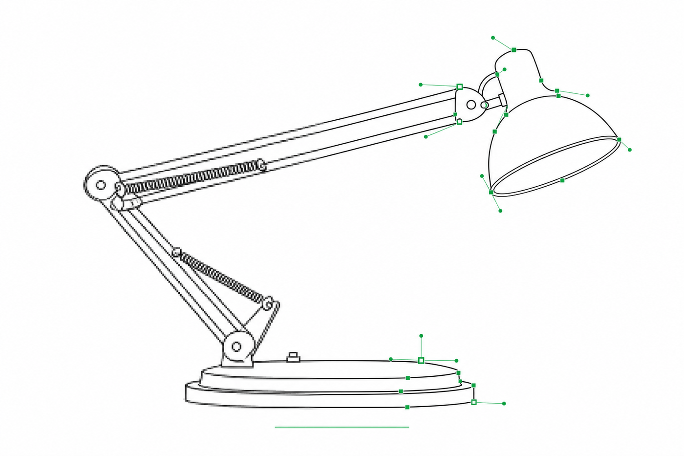
Image to SVG for Illustrator: How to Get Editable Strokes for Technical Line Art
Why many image-to-SVG conversions arrive in Illustrator as filled outlines you can't restyle — and two workflows that produce stroke-based, centerline-style SVG line art with adjustable line weights.